Web Programming
Lecture 2

CSS

Josue Obregon

Seoul National University of Science and Technology
Information Technology Management
Lecture slides index

March 7, 2026

Agenda

Objectives

  • Explain the role of CSS in web development and distinguish it from HTML in terms of structure vs. presentation.
  • Write basic CSS rules using selectors, properties, and values, and apply them to HTML elements.
  • Use common CSS selectors (element, class, id, and grouping) to style elements in a web page.
  • Explain and apply the cascade and specificity rules to determine how conflicting CSS styles are resolved.
  • Use fundamental CSS layout techniques, including the box model and basic flexbox properties, to control spacing and alignment of elements.

What are we going to learn?

Roadmaps: Frontend, backend and fullstack

Analogy of a web page

Words + images

HTML

CSS

JavaScript

Cascading Style Sheets

<head>
  ...
  <link rel="stylesheet" href="styles.css">
  ...
</head>
  • CSS describes the appearance and layout of information on a web page (as opposed to HTML, which describes the content structure)
  • Can be embedded in HTML (bad) or placed into separate .css file (much better)

Best Practice

To keep your code clean and easier to mantain, separate your styling into its own file.

Basic CSS Syntax

  • A CSS file contains one or more rulesets
    • A ruleset consists of: one or more selectors and a declaration block
  • Selectors specify which HTML elements the rule applies to.
  • Declaration blocks contains one or more declarations.
    • Each declaration has: a property (what style to change) and a value (how the style should appear)
  • Each property can accept different values (for example colors, sizes, or fonts).
  • There are 200+ css properties and modern editors like VS Code help with autocomplete.

Basic CSS Syntax Example

Example

h1 {
  color: red;
  text-decoration: underline;
  font-family: sans-serif;
} 

p {
  font-size: 16px;
  color: gray;
  line-height: 1.5;
}

Inline vs Embedded vs External CSS

Inline

<h1 style="color:red;">
    This text will be red!
</h1>

In the <head>

<head>
    <style>
        h1 {
            color: red;
        }
    </style>
</head>
  • In general, it is better to put your styles in external stylesheets and apply them using <link> elements.
<link rel="stylesheet" href="style.css">

Common CSS properties

CSS Property Example Values
color red, blue, #000000 (black)
text-align left, right, center, justify
width, height auto, 100px, 50%, 100%
margin, padding 0, 10px, 20px, 1em
font-family Arial, Times New Roman, sans-serif, serif
font-size 12px, 16px, 1.5em,
font-weight normal, bold, 400, 700
border none, 1px solid black, 2px dashed red, 3px double blue

Grouping selectors

a, p, h3 {
    color: green;
    font-size: 14pt;
}

p {
  text-decoration: underline;
}
  • Allows us to reduce redundancy by grouping together rules into rulesets to style multiples types of elements with common styles.
  • What will text inside the <p> tag look like here?
<body>
    <h1>This is h1 heading</h1>
    <h3>And this is an h3 heading</h3>

    Here we have regular text.
    <p>
        Here we have a paragraph. 
    </p>
</body>

id and class

id

  • Unique identifier for an element
  • Each unique id can only appear once per page
  • Each element can only have one id
  • Use id for unique elements

class

  • Non-unique grouping attribute to share with many elements
  • Many elements (even of different types) can share the same class
  • Each element can have many different classes
  • Use class for styling

Cascade and specificity

All styles “cascade” from the top of the sheet to the bottom

Source Order: If multiple CSS rules have the same specificity, the one that appears later in the stylesheet overrides earlier ones.

Specificity: More specific selectors (like IDs) override less specific ones (classes, tags).

  1. inline style="color:red"
  2. id #intro
  3. class .highlight
  4. type p, h1, div

Importance (!important): Styles marked with !important override specificity and source order, becoming top priority.

Which one wins?

CSS

p { color: blue; }
#intro { color: red; }

HTML

<p id="intro">Hello world</p>

What about here?

CSS

p { color: blue; }
.highlight { color: green; }

HTML

<p class="highlight">Hello world</p>

The Document Object Model (DOM)

How the browser represents the hierarchy of a page. Very useful when thinking about selectors!

For example:

  • Every HTML tag (<p>, <em>, <body>, etc.) is part of the DOM, and has a place in a tree hierarchy.
  • They all have a parent (<body>’s is <html>) and almost always have a child (<title> is a child of <head>).
  • You don’t build a DOM, but the browser does, which allows you to access it.

Example DOM

<html>
  <head>
...
  </head>
  <body>
    <h1>heading</h1>
    <p>
    hello <a href="">there</a>
  </p>
    <ul>
      <li>one</li>
      <li>two</li>
      <li>three</li>
    </ul>
  </body>
<html>

Basic CSS Selectors

Syntx Name Description
a, b Multiple Element Selector
a b Descendant Selector Selects all b elements located anywhere inside of a
a > b Child Selector Selects all b descendants directly inside a elements
[a=b] Attribute Selector

Responsive web design

Adjusts a website’s layout to fit the screen size of the device it’s being viewed on.

It allows a single website to work across many devices, including desktops, tablets, and phones.

Responsive design related concepts:

  • Viewport
  • Media queries
  • Layout techniques in CSS

Viewport

  • The viewport is the user’s visible area of a web page.

  • The viewport varies with the device, and will be smaller on a mobile phone than on a computer screen.

Meta viewport tag

Include this line in the <head> tag of your HTML document.

<meta name="viewport" content="width=device-width, initial-scale=1.0">
  • <meta name=viewport> tag is essential for controlling how a webpage fits into different screen sizes

  • width=device-width match the width of the viewport to the width of the device

  • initial-scale=1.0 defines the zoom of the page the moment it loads

  • Media types:

    • print, screen, hover, etc.
  • Media features:

    • height, width, orientation, etc.

Media query

  • A media query is a CSS technique that allows styles to be applied only when certain conditions about the device or screen are true.
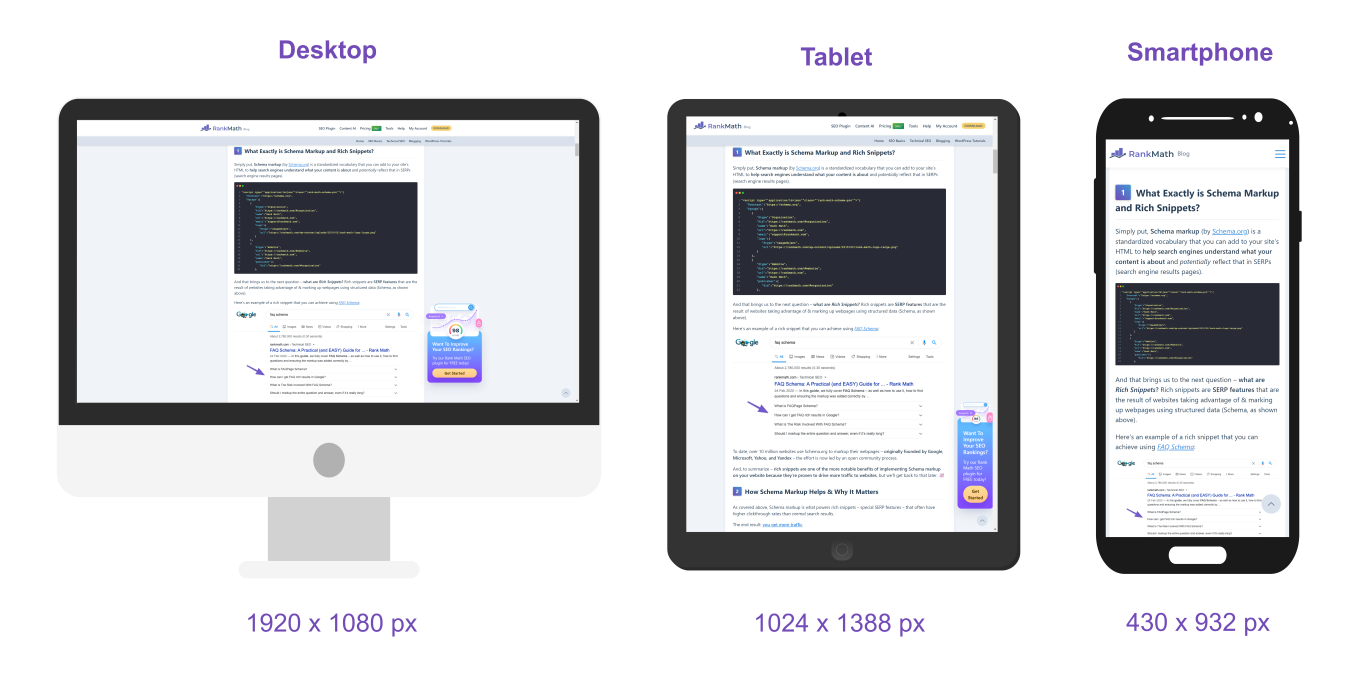
  • Media queries are commonly used to make websites responsive, adapting layouts for different screen sizes such as desktops, tablets, and phones.
  • Common media query conditions: max-width, min-width, orientation

Basic Syntax

@media (condition) {
  /* CSS rules applied only if
  the condition is true */

}

Example

@media (max-width: 600px) {
  body {
    background: red;
  }
}

Note

The rule in the example applies only when the screen width is 600px or smaller.

Layout techniques in CSS

Layouts let you correctly lay out (position) your boxes in relation to one another, and the browser viewport.

  • Box Model (margin/padding/border)
  • Flex
  • Grid
  • Positioning
  • Float (less common today)

Note

We will focus on Flexbox

CSS box model

The CSS box model module defines the margin and padding properties, which along with the height, width and border properties, make up the CSS box model.

Flexbox

  • Flexbox is a set of CSS properties for aligning block level content.
  • Flexbox defines two types of content: “containers” and “items”.
    • “Container” (sometimes referred to as the flex parent): the direct parent element of the HTML elements whose position you would like to control
    • “Items” (sometimes referred to as the flex children): the directly nested elements inside the parent container whose position you are controlling.
  • Most properties on the container can be set to determine how its items are laid out. Some properties can be directly applied to the flex items.

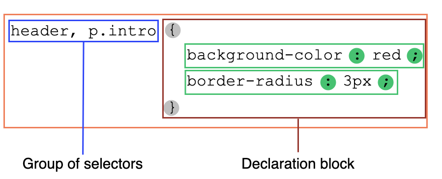
To label the container as a flex container we use the CSS set

div {
    display: flex;
}

Flexbox

<section>
    <p>0</p>
    <p>1</p>
    <p>2</p>
    <p>3</p>
</section>

The aftermath of display:flex

<section>
   <p>1</p>
   <p>2</p>
</section>

Basic properties of a flex container

display: flex;

-makes an element a “flex container”, items inside automatically become “items” - by default, starts as a row

justify-content: flex-end; (flex-start, space-around,…)

  • indicates how to space the items inside the container along the main axis

align-items: flex-end; (flex-start, center, baseline,…) - indicates how to space the items inside the container along the cross axis

flex-direction: row; (column) - indicates whether the container flows horizontally or vertically (default row)

flex-wrap: wrap; (no-wrap, …) - indicates whether the container’s children should wrap on new lines

The Impact of Adjusting flex-direction

  • The default flex-direction is row. If you change the flex-direction to column you are changing the orientation of the axes.
  • The properties arranging elements along each axis does not change
    • Example: justify-content still controls items along the main axis. The main axis is just vertical now

CSS grid layout

It divides the page into major regions and defines the relationship in terms of size, position, and layering between parts of a control built from HTML primitives.

To label the container as a grid container we use the CSS set

div {
    display: grid;
}
  • grid-column-gap and grid-row-gap specifies the gap between the columns and rows
  • grid-template-columns and grid-template-rows specifies the size of the rows in a grid layout

CSS Frameworks

  • CSS frameworks are pre-built collections of CSS styles and components that help developers build web pages faster.
  • They provide ready-made styles for common interface elements such as:
    • buttons
    • forms
    • navigation bars
    • layouts
    • responsive grids
  • Popular examples include:
  • These frameworks help developers avoid writing all CSS from scratch and promote consistent design across pages.

Bootstrap

Bootstrap is one of the most popular HTML, CSS, and JavaScript framework for developing responsive, mobile-first websites.

Bootstrap is opensource under the MIT license .

  • Include this code in your <head> element of your HTML document
<link href="https://cdn.jsdelivr.net/npm/bootstrap@5.3.3/dist/css/bootstrap.min.css" rel="stylesheet" integrity="sha384-QWTKZyjpPEjISv5WaRU9OFeRpok6YctnYmDr5pNlyT2bRjXh0JMhjY6hW+ALEwIH" crossorigin="anonymous">

Next week

Say hello to our new friend, JavaScript…

Acknowledgements


Back to title slide Back to lecture slides index